REBRANDING
LOGO
VISUAL IDENTITY
GUIDELINES
IMAGERY
SOCIAL MEDIA
WEB DESIGN
Keytive has evolved into Nordkey.
As part of the rebrand, I developed a new visual identity and repositioned the brand within the market. As a global online software reseller, Nordkey needed a stronger and more distinctive presence to stand out from competitors.
The new identity focuses on clarity, trust, and scalability, creating a modern brand experience designed for a global audience.

Logotype
Colors
Typography
Nordkey is the heart of the brand family.
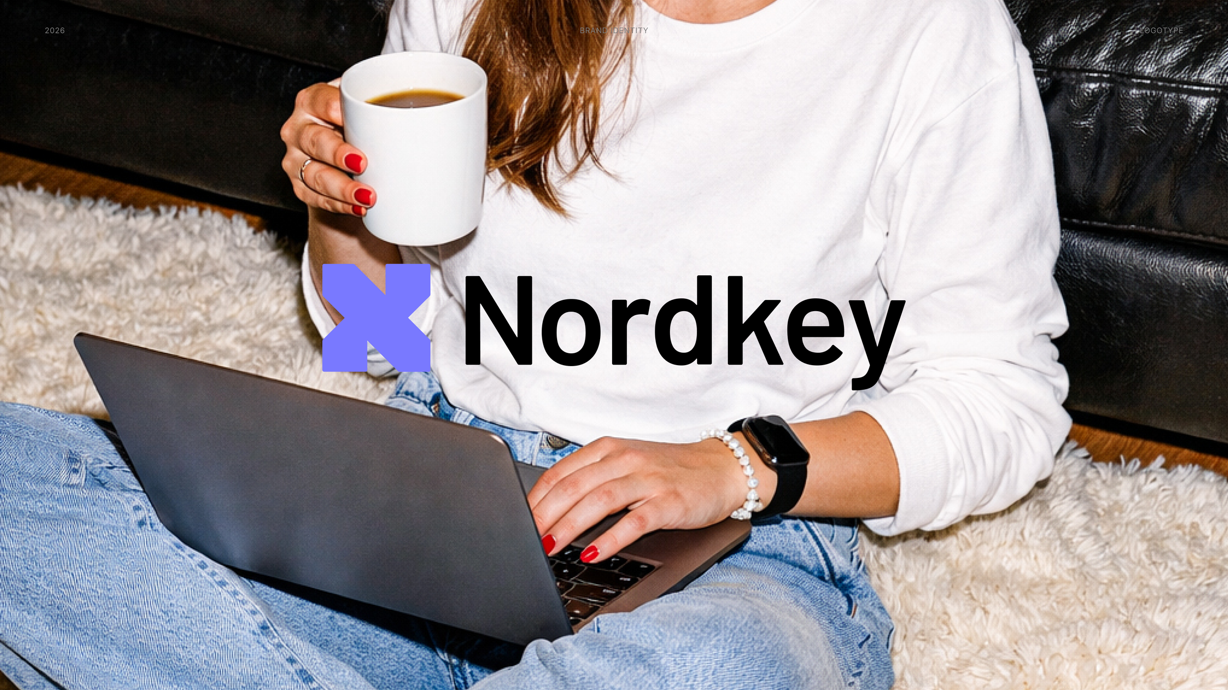
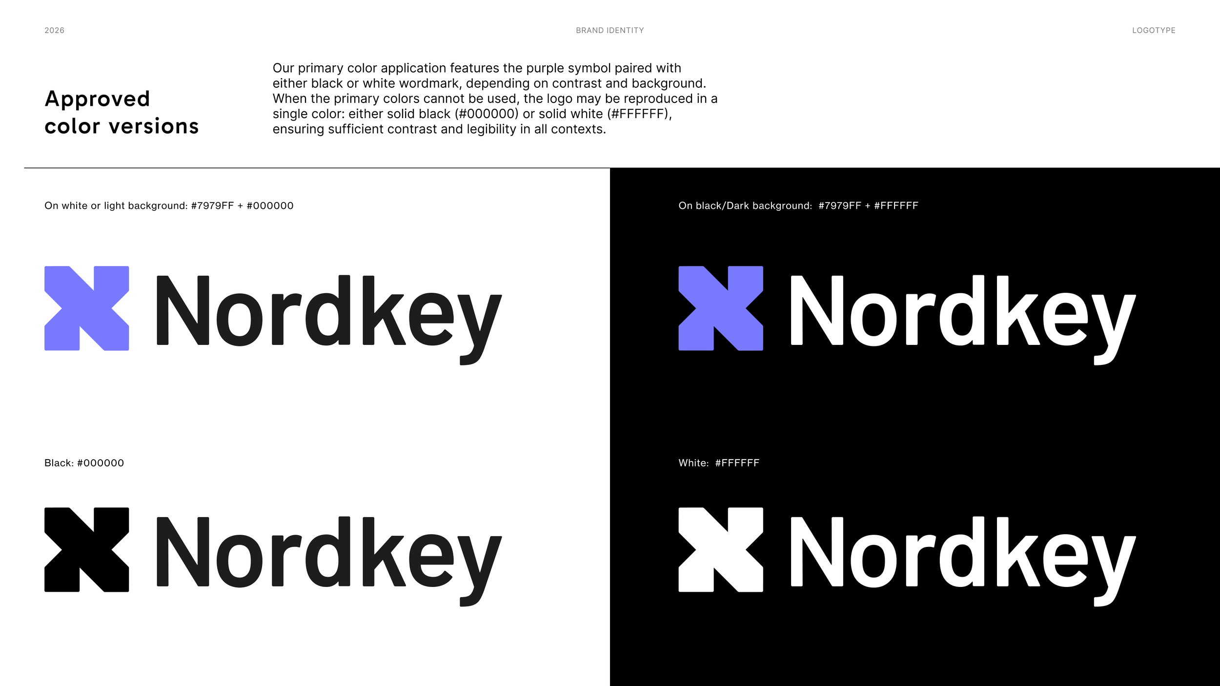
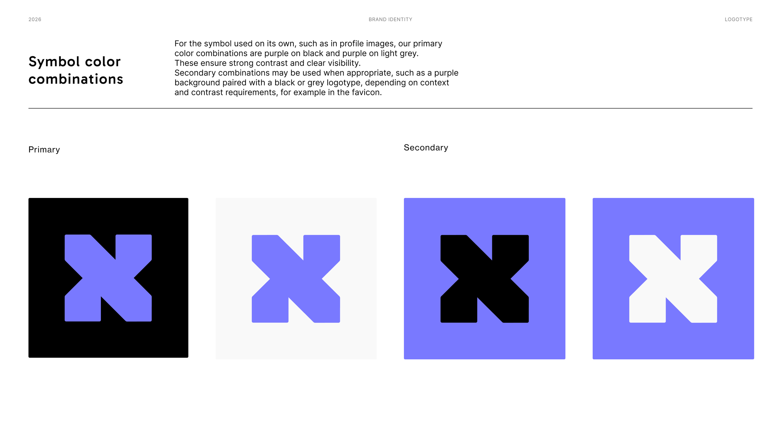
The logotype is built from an abstract composition inspired by the letters N and K. Rather than showing the letters explicitly, the design captures their essence in a subtle and refined way.
This abstraction allows the symbol to move seamlessly across all brands within the Nordkey ecosystem. By keeping the N and K understated, the mark becomes a unifying visual element: recognizable, flexible, and adaptable to different contexts while still rooted in the Nordkey identity.
The symbol is a visual key that connects every part of the brand while allowing each expression to stand on its own.
The typography combines character with clarity. Gabarito is used for headings, bringing a distinctive and welcoming tone to the brand. Inter is used for body text, chosen for its high readability and clean, modern appearance. Together, they create a balanced typographic system that is both expressive and easy to read across all applications.
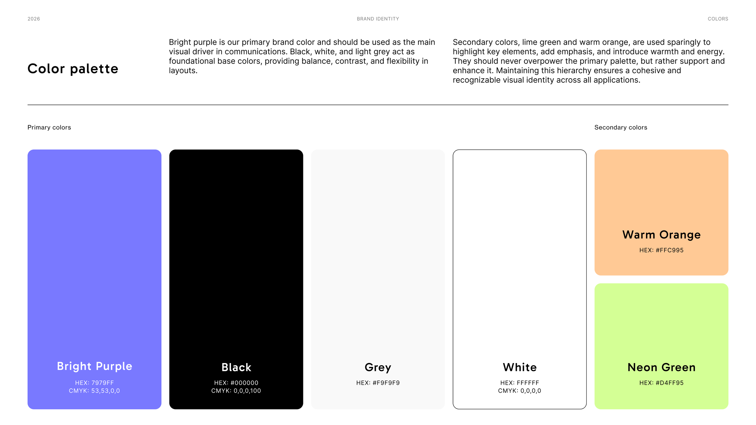
The color palette is bold, yet warm and welcoming. Bright purple serves as our primary brand color, supported by black, white, and light grey as foundational base colors. Lime green and warm orange serve as secondary colors, adding vibrancy and an extra sense of warmth to the palette.

Imagery
Graphic Elements
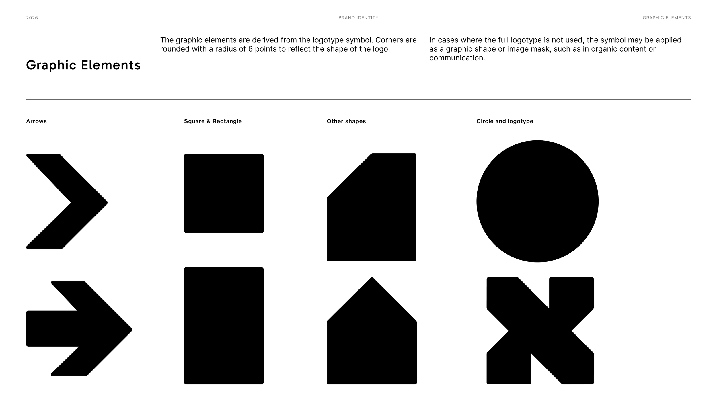
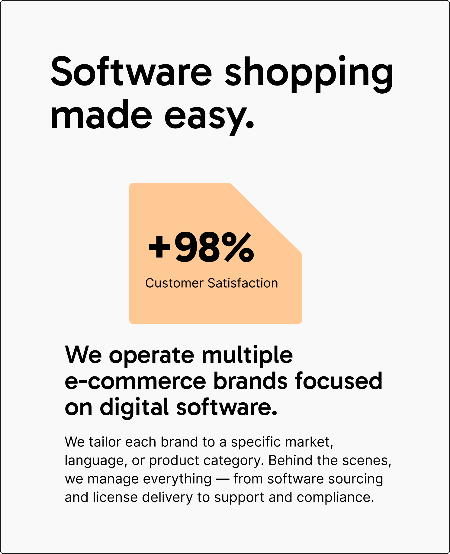
The graphic elements originate from the logotype symbol. Rounded corners echo the form of the logo, establishing a clear visual relationship between the symbol and the wider brand system. This soft geometry creates cohesion while expressing a warm, welcoming and human character.
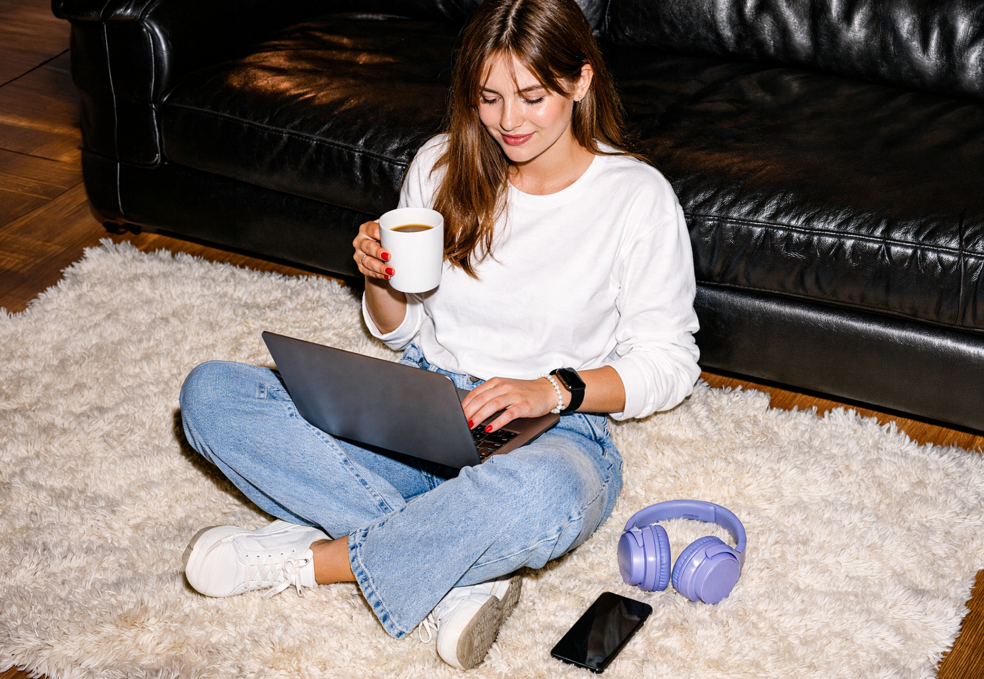
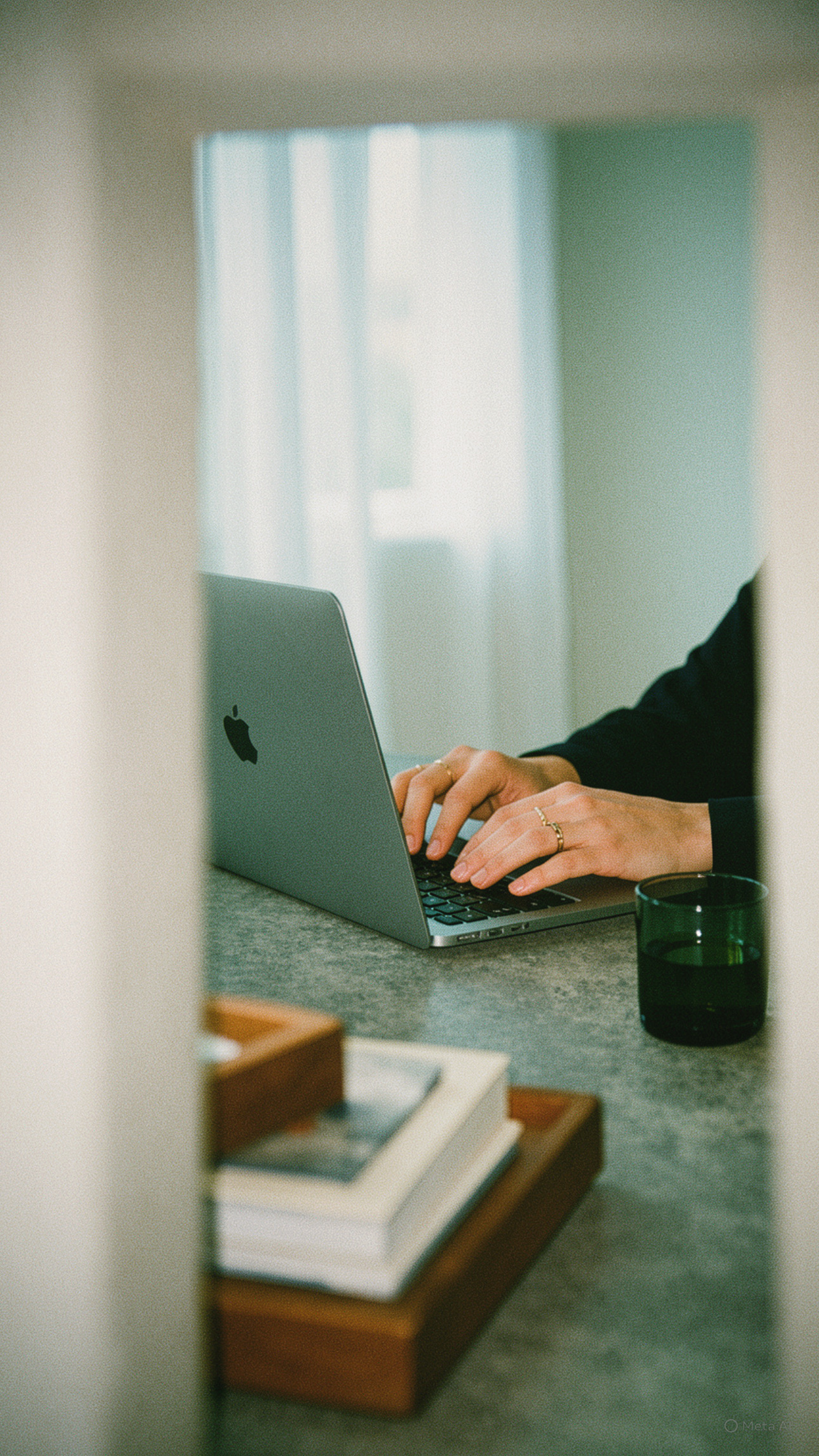
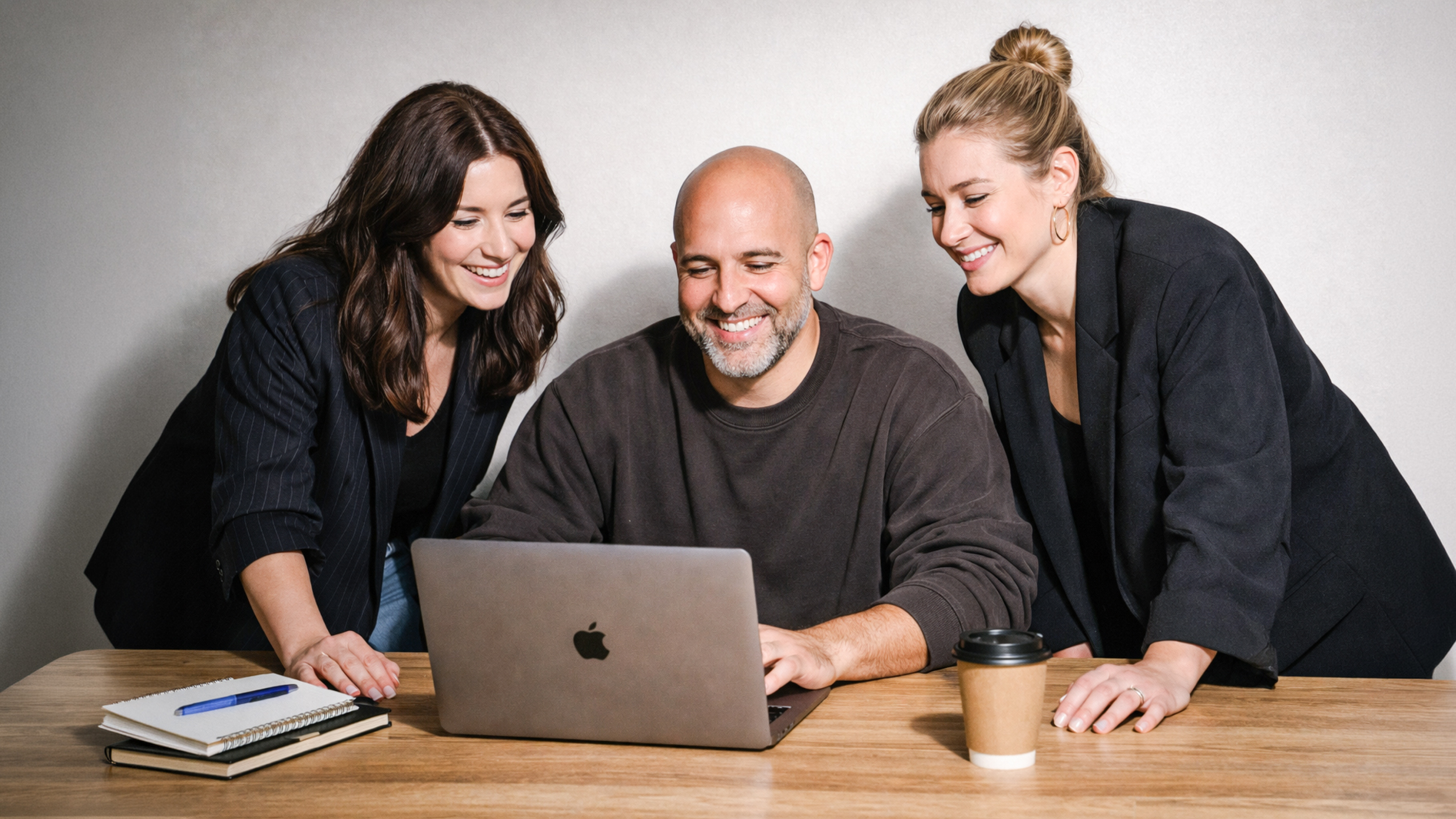
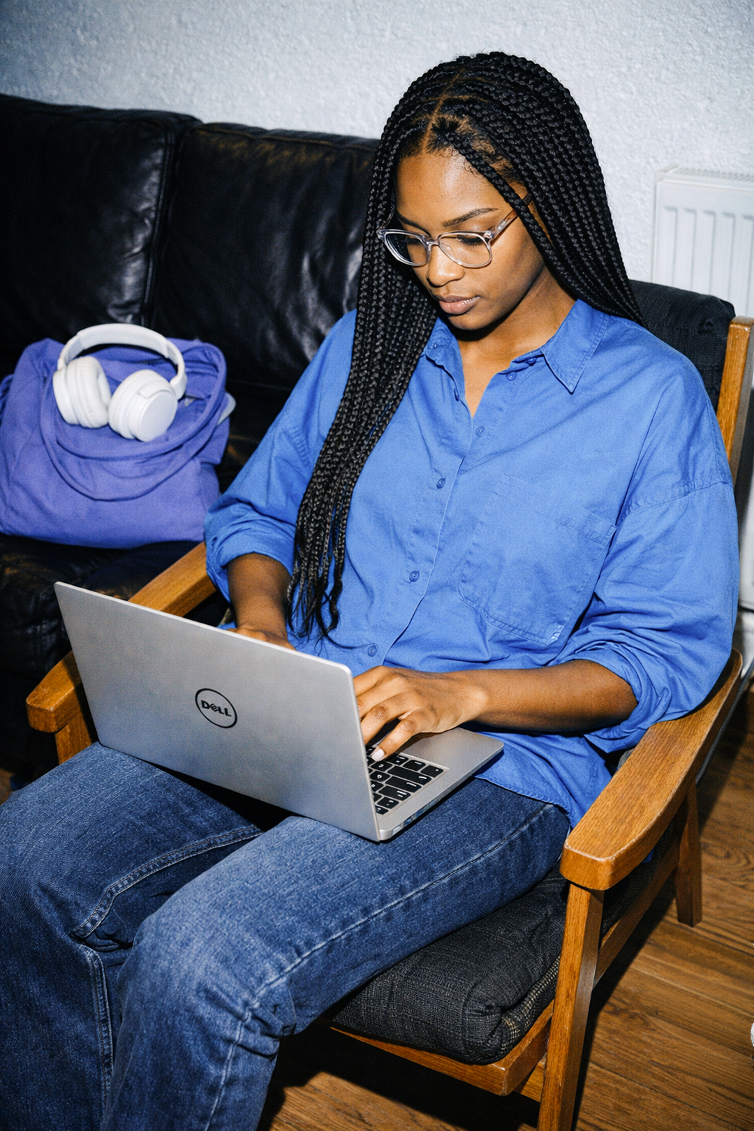
The imagery is genuine, relatable and unpolished. We favour photography that captures real, everyday situations using direct, hard flash. This raw visual style creates an honest and intimate expression while maintaining a warm lifestyle feeling around the brand.