REBRANDING
LOGO
VISUAL IDENTITY
GUIDELINES
IMAGERY
SOCIAL MEDIA
WEB DESIGN
Relativt is a communication agency based in Gothenburg and Stockholm. From starting as a small company it has now grown bigger and been established. It was simply time to let the visual identity reflect what they have become on the inside. This is how we are. The same Relativt, but with a slightly sharper design language and an identity that does more justice.
The goal was not to change but to renew.

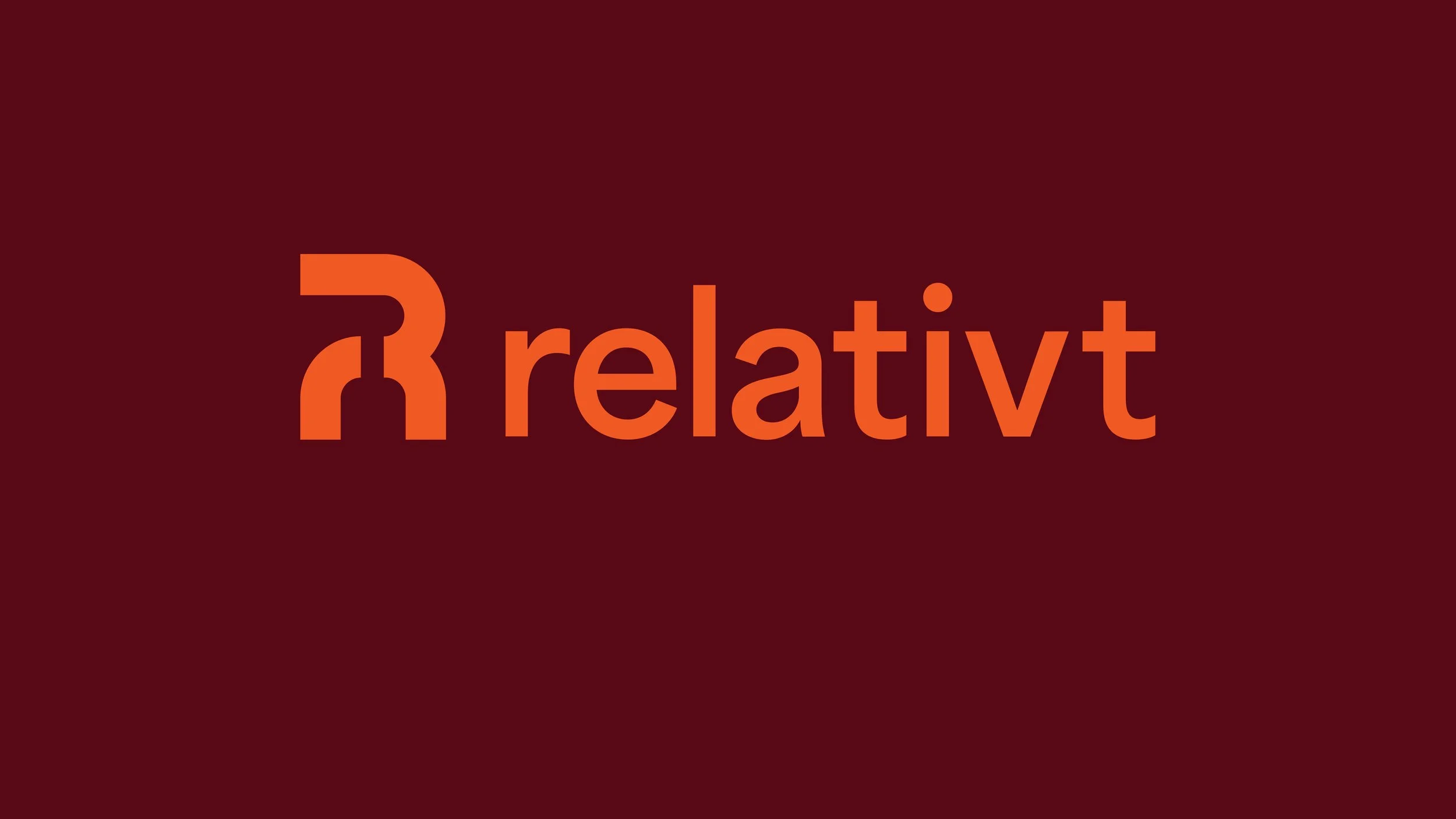
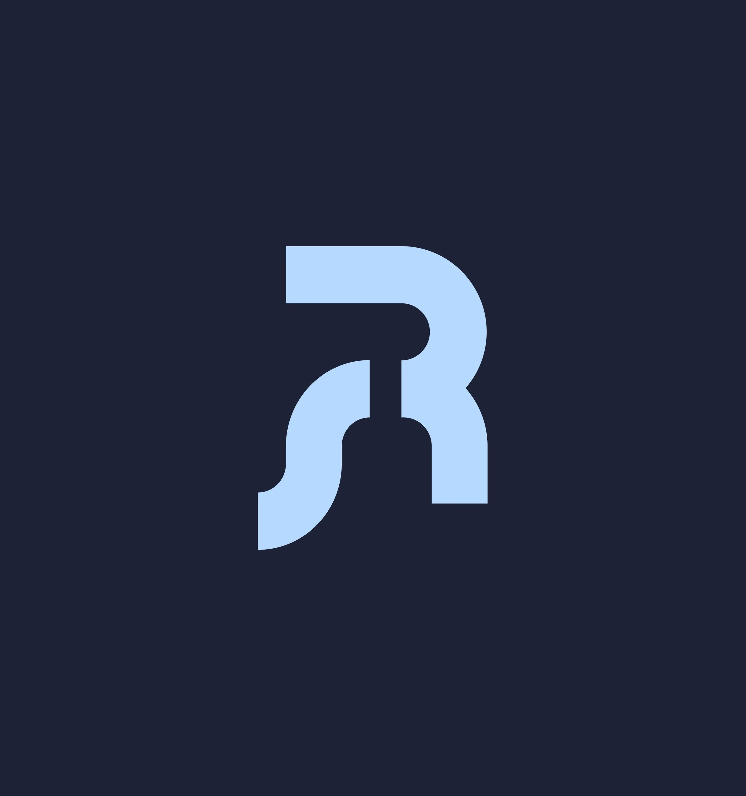
The new logo is an update of Relativt's well-known double-R. I made a new modern interpretation where the small r meets the large R in a shape that feels both familiar and innovative. A softer, more abstract and geometric shape but with the same meaning.
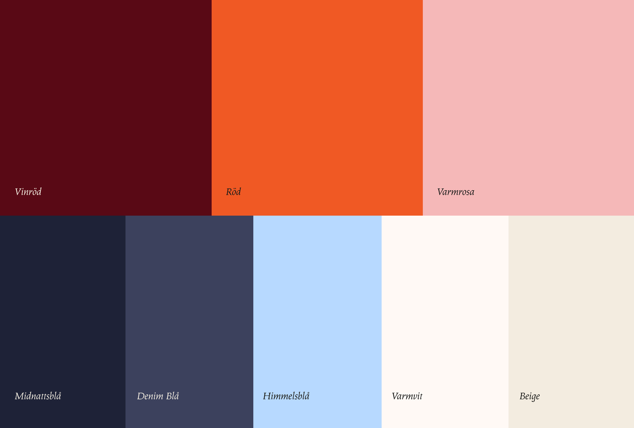

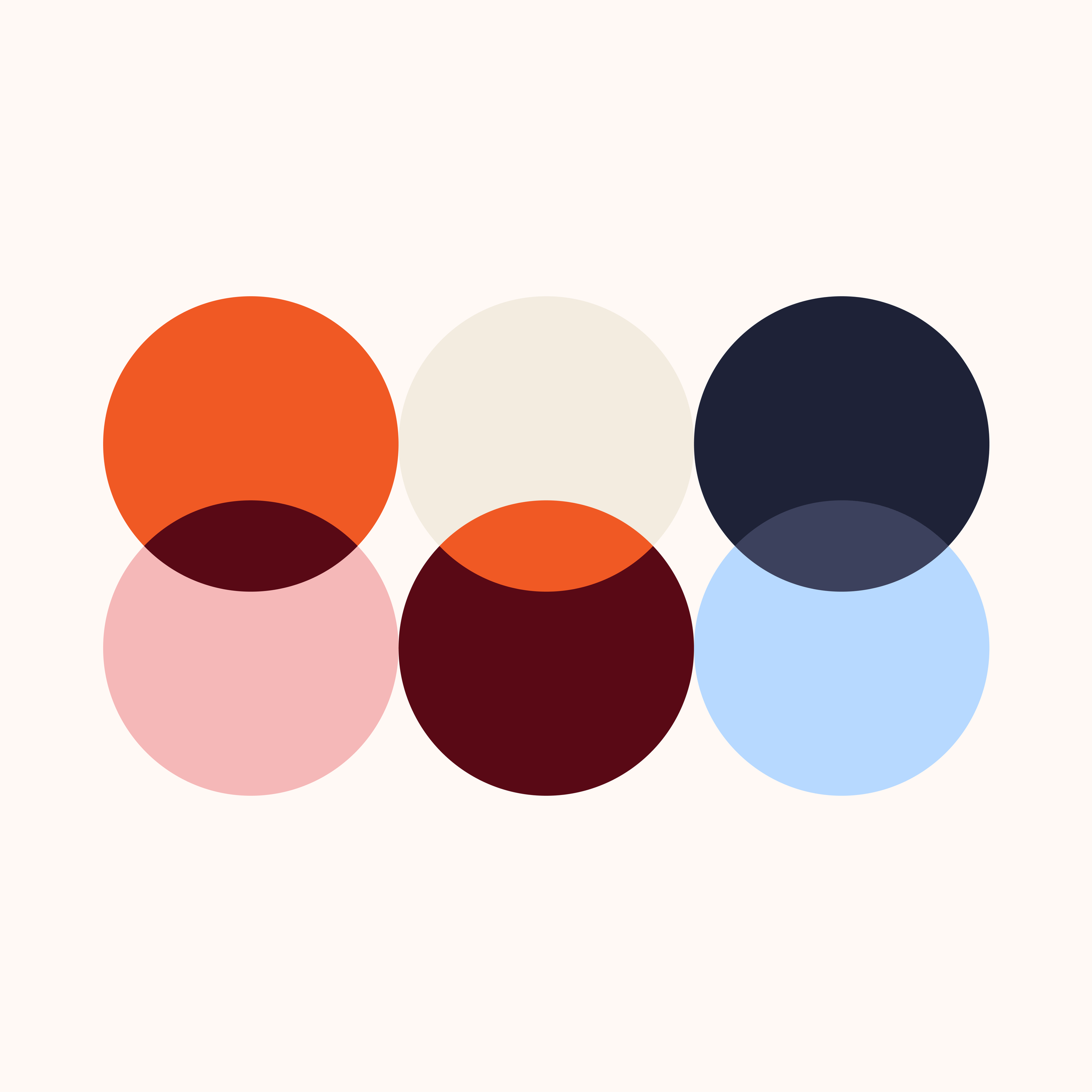
The new color palette is an update to their existing colors. The colors are similar but a bit more mature and softer tones.
The fonts consist of a combination of two styles: a soft and inviting sans serif that gives a friendly and modern impression, together with a characteristic serif that is used to highlight important words and headings, words to emphasize.
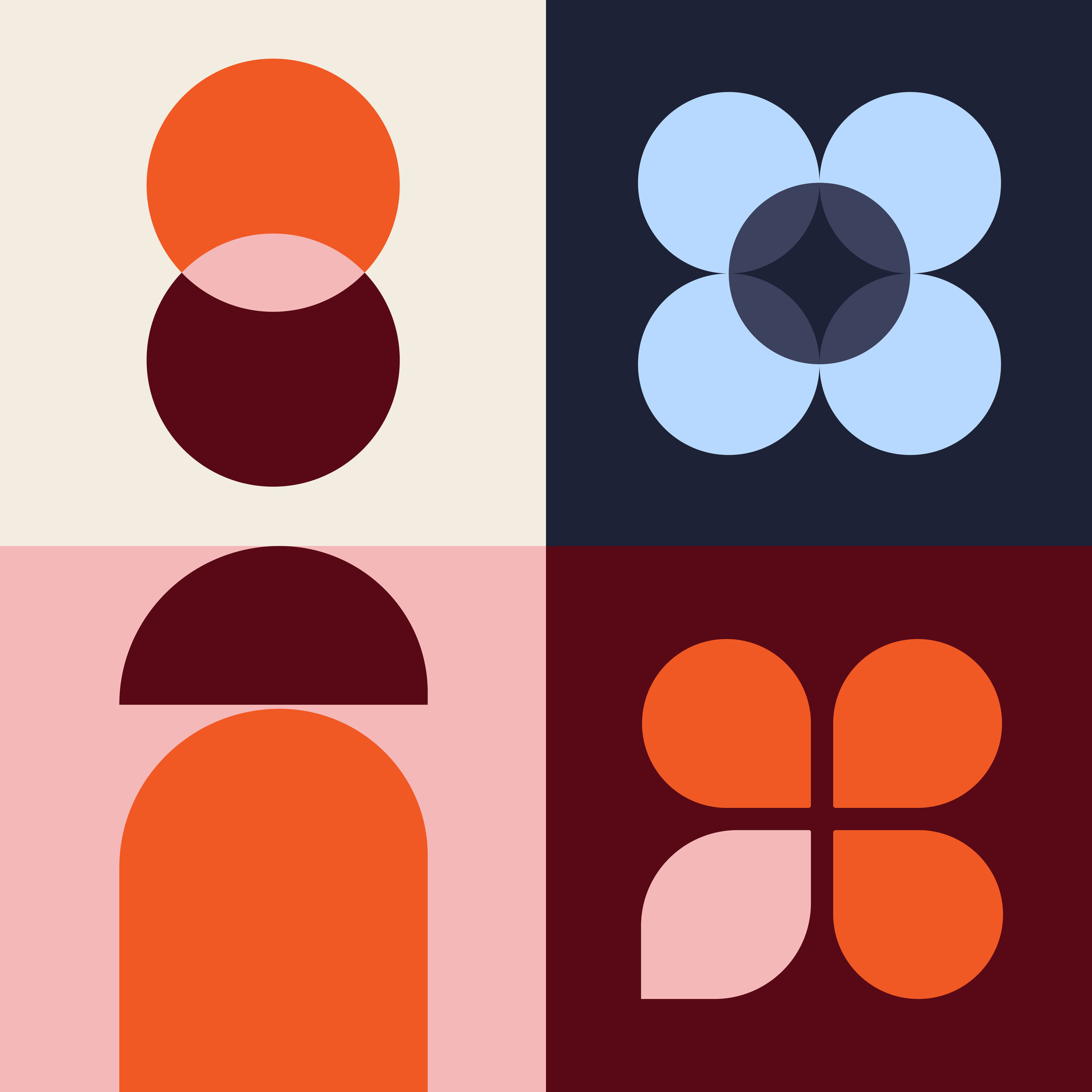
The new illustrations are inspired by the Bauhaus style and its geometric and simple shapes. They create an inviting and welcoming feeling with the soft shapes.
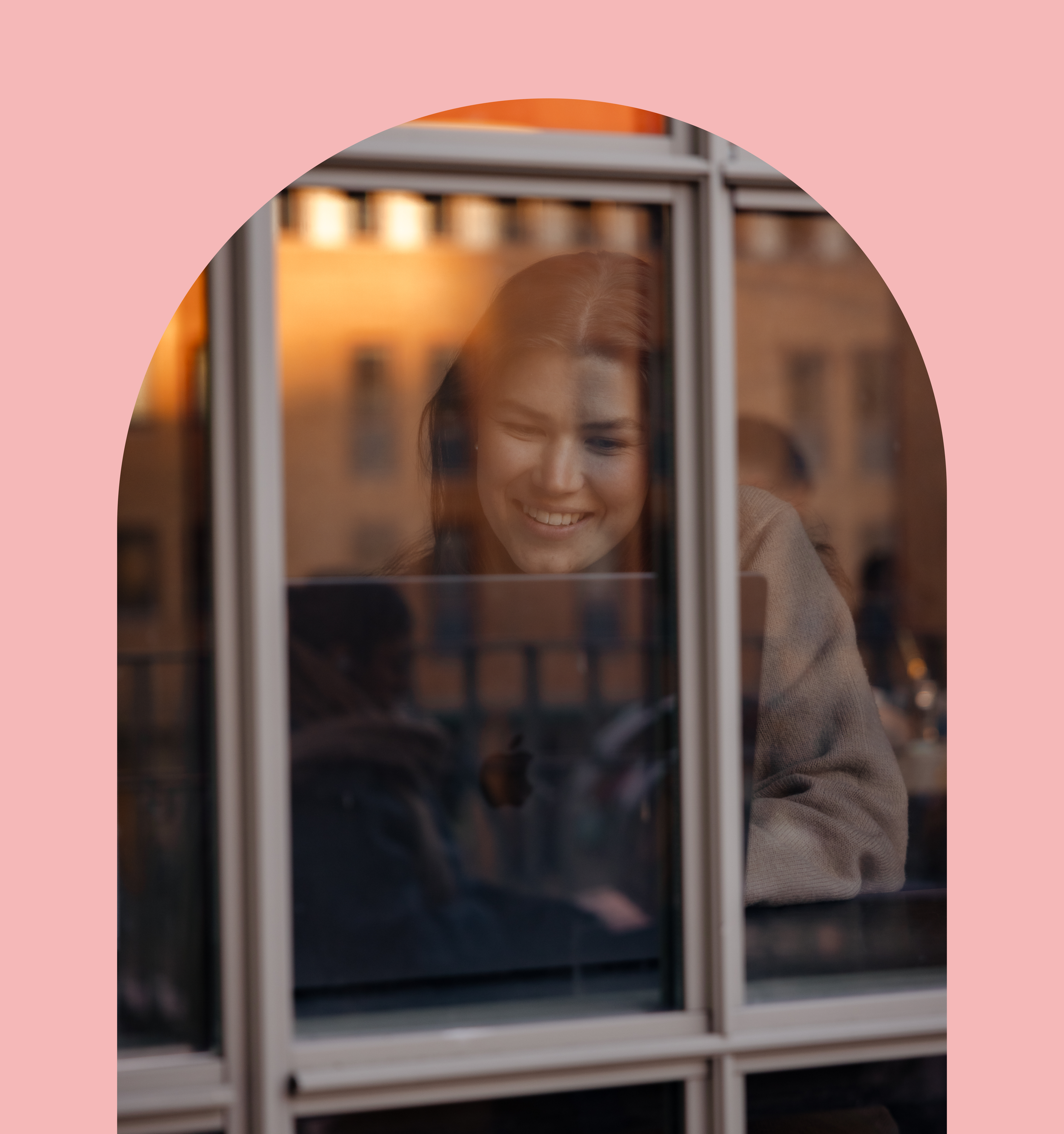
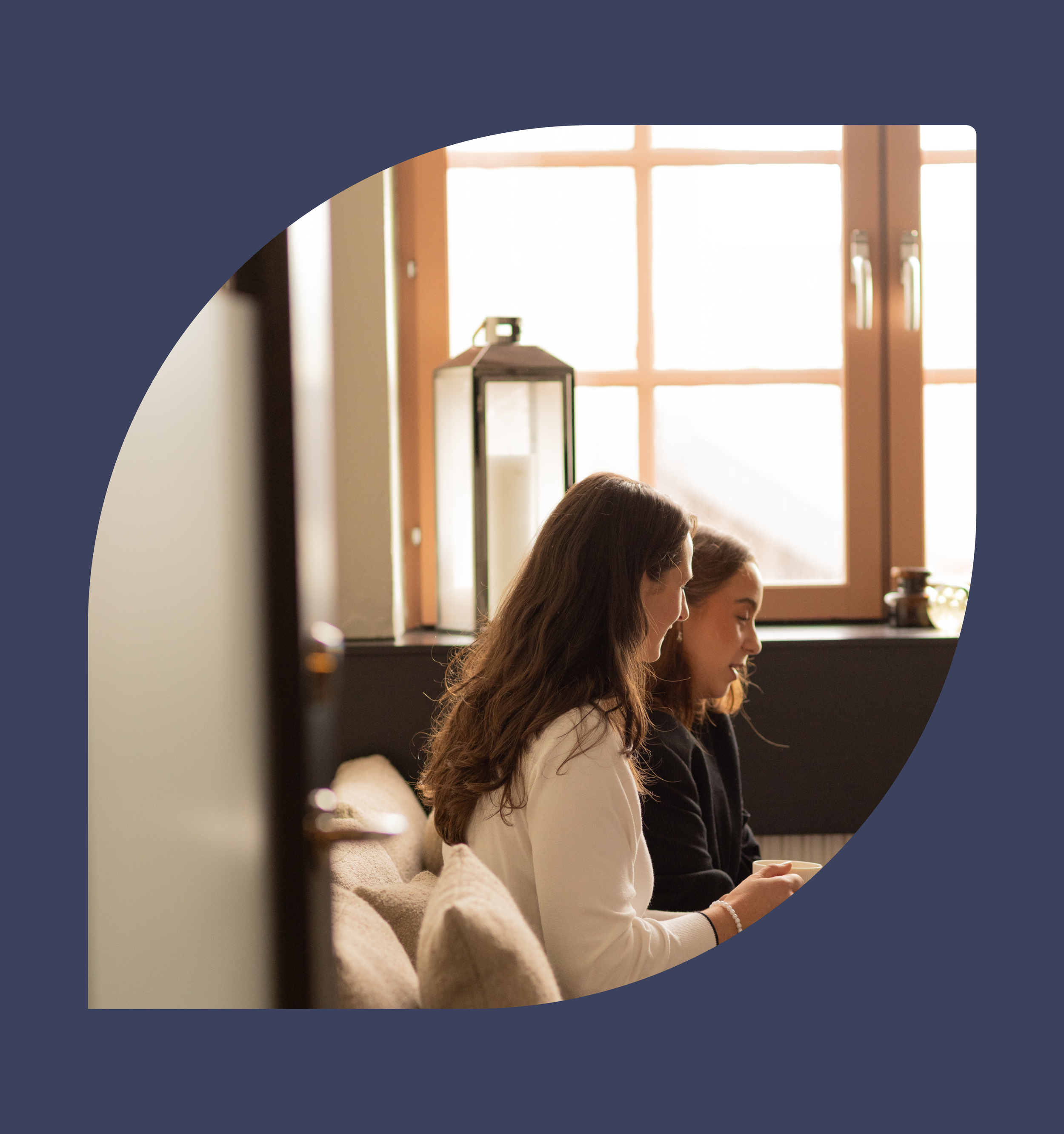
When it comes to the imagery, I wanted to give a warm and inviting feeling. The images reflect what they are doing in-the-moment, like something taken out of a movie. It should feel genuine, not staged.

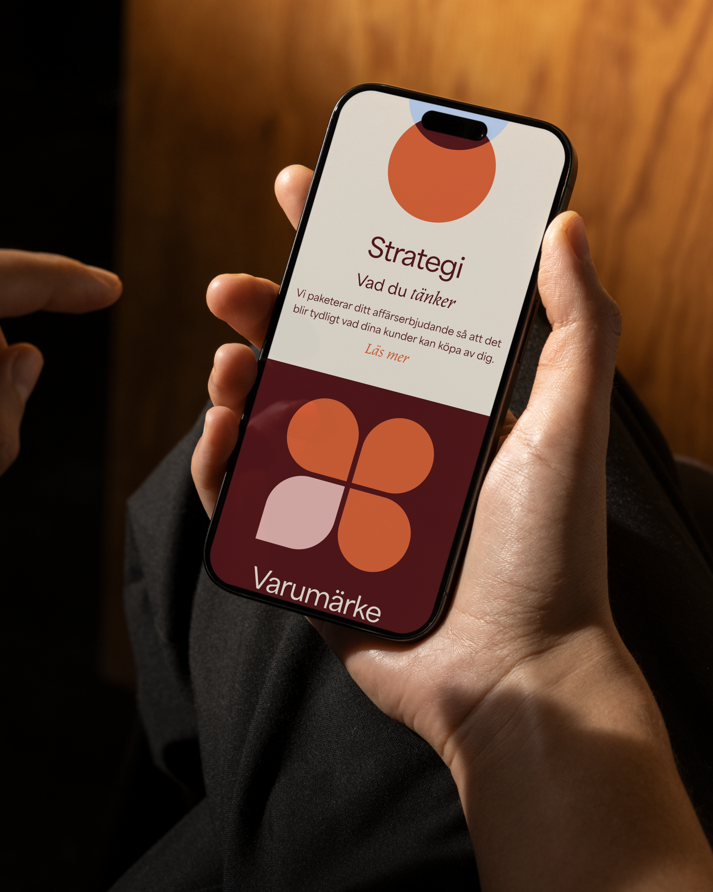


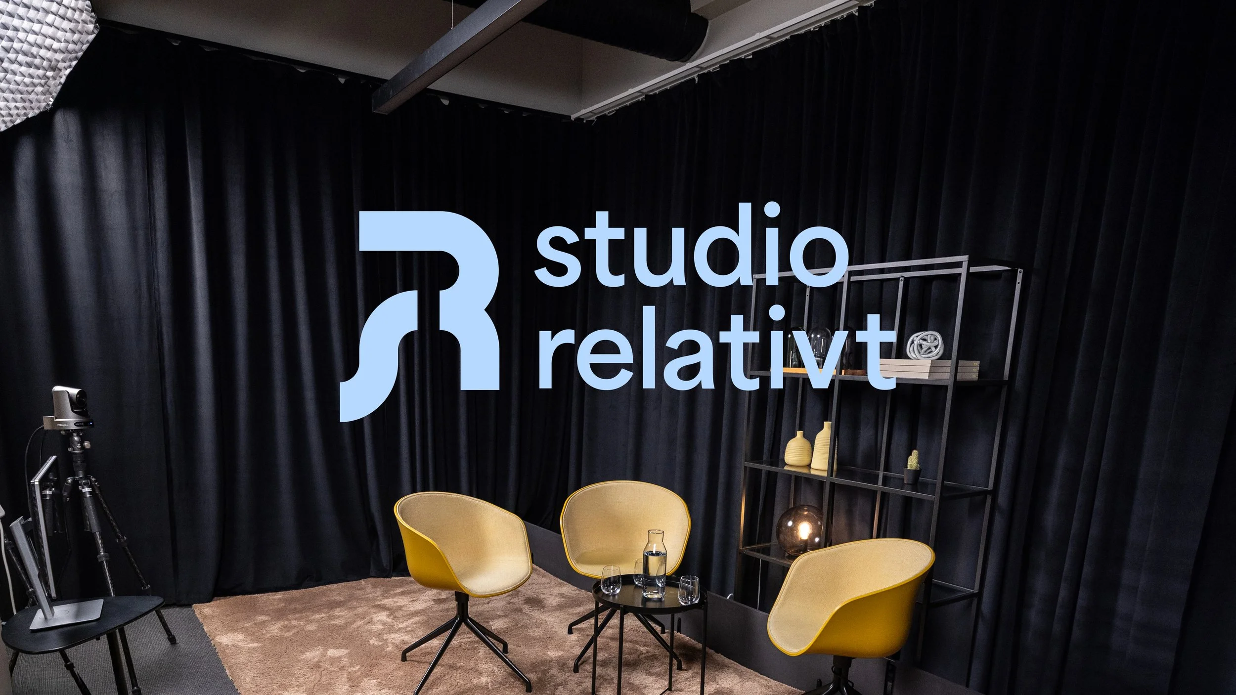
As part of our new identity, Studio Relativt also got its own logo. A variation of our double-R, but of course with the letters S+R.
The color scheme for the studio is our blue tones.